Customer Experience Case Study: O’Hare Airport’s Rainbow Corridor
In this customer experience case study, we explore the brilliant strategies deployed by Chicago’s O’Hare Airport to create a stellar customer experience for travelers. This case study highlights how to turn a negative physical space into an enhanced customer experience. Here’s a look at this brilliant strategy that was deployed at one of the busiest, and biggest, airports in the world.
O’Hare Airport Turns a Dismal Customer Experience Into An Internationally Known Tourist Attraction
Back in the 1980s, O’Hare Airport managers & United Airlines deployed a tried-and-true strategy for putting their venue on the map: they hired a prominent architect to design an amazing physical space. Architect Helmut Jahn was brought in to design the United terminal. He designed a physical space with lots of steel and skylights filled with natural light and featuring a modern, airy feel. The city of Denver also pursued this strategy when city managers hired Daniel Liebeskind to design a dramatic new wing of the Denver Art Museum.
O’Hare Airport’s “Rainbow” Corridor A BIG Hit With Travelers
 The new United terminal got rave reviews when it opened in the late 1980s. But it was the underground space BETWEEN concourses that really put O’Hare Airport on the map.
Anyone who’s lived in Chicago or traveled through Chicago’s O’Hare Airport knows that walking between the concourses in the terminals is probably the equivalent of a 5K race. The underground tunnels between the terminals are excessively long, usually cold, and the moving walkways plodded along at a snail’s pace. God help you if you didn’t have much time between connecting flights.
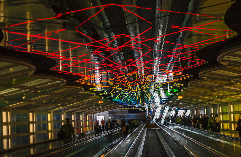
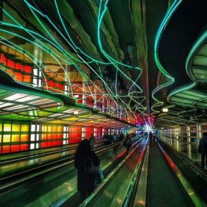
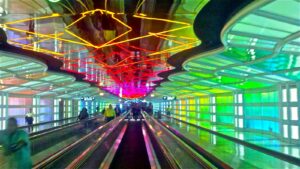
It was this dismal space that O’Hare Airport planners transformed to create an amazing customer experience. This particular underground tunnel is located in Terminal 1, between the B & C concourses. What was once a long, dreary, cold ride on moving walkways was reimagined as a colorful corridor with mirrored ceilings lit with a rainbow of neon tubes running along the ceiling. This 800-foot-long neon light sculpture was designed by Michael Hayden, who’s worked for Disney and created light displays for Disney’s Epcot Center.
In addition to the brilliant colors moving and morphing and traveling along the ceiling from neon lights, the side walls featured glowing squares of backlit panels that emit a soft glow of light and color.
Sound was added to enhance the experience. In the early days of the “Rainbow Corridor,” soft New Age music played as people rode the moving walkways, mostly staring upward watching the light show in fascination. The original music was created by William Kraft, the former conductor of the LA Philharmonic. Whether you liked the original music or not, it got your attention and created a true experience. Some people found the music relaxing. Others called it “spooky” or “eerie.” Once a Chicago Tribune writer described the New Age music as evocative of a drug overdose, United opted to switch out the music with snappy versions of the United theme song (Gershwin’s “Rhapsody in Blue”).
The bottom line is that this boring corridor was transformed into an experience where people would ride the moving walkway one way, and then turn around and ride it back in the other direction just to see the light show again, from a different angle.
As a result of this brilliant strategy, Atlas Obscura lists the Rainbow Corridor as one of the “18 Most Delightful Airport Features.” TripAdvisor highlights the corridor as something to see if you’re traveling through O’Hare Airport. Many individuals have filmed the light show on their smartphones and posted the video to YouTube.
Customer Experience Case Study Learning Points
 Most of us will never have the opportunity or the budget to create a mile-long corridor of light and sound to entertain our customers. But this strategy deployed by O’Hare Airport and United poses lots of opportunities to think about how you can create an amazing customer experience, regardless of the size of your business. Here are some learning points:
Customer Experience Case Study Learning Point 1: DEFINE Your Desired Customer Experience
The first place to start is to define the customer experience you want to create. For example, do you want your customers to be comfortable in the physical environment so they want to come back? Do you want to appeal to a specific demographic group? Take some time to think about the feeling and experience you want to create. Then make a list of how you can create that experience, prioritize the list, and start deploying changes that enhance your customer’s experience.
Customer Experience Case Study Learning Point 2: Enhance Your Physical Space
One way to create a great customer experience when you have a brick-and-mortar business (an actual office) is to create a physical space that’s appealing to your customers. Take a look at your office and the areas where your customers interact with you. Is the space comfortable? Do you have colors and décor that appeals to your target customers? If your customers have to sit and wait, are the chairs clean and comfortable?
Customer Experience Case Study Learning Point 3: Set the Mood with Sound
If you want your customers to relax, play relaxing music. If you want your customers engaged and lively, play peppy, cheerful music. The point is to think about the type of business you operate and make sure the audio experience supports that.
Customer Experience Case Study Learning Point 4: Jumpstart Your Service Experience
If you’re in a service business, or a business where the personal touch is appreciated, develop a process and a culture that truly takes care of your customers.
 By making a positive customer experience a priority for managers and staff, you can transform your business, retain customers, and if the economy stalls, these actions literally can help recession-proof your business.
Need help defining your customer experience? Contact DeWinter Marketing to help!

